Why Colours and Logo Files Matter in Promotional Products & Branded Apparel
Published on 12/02/2026 by Xpromo Team
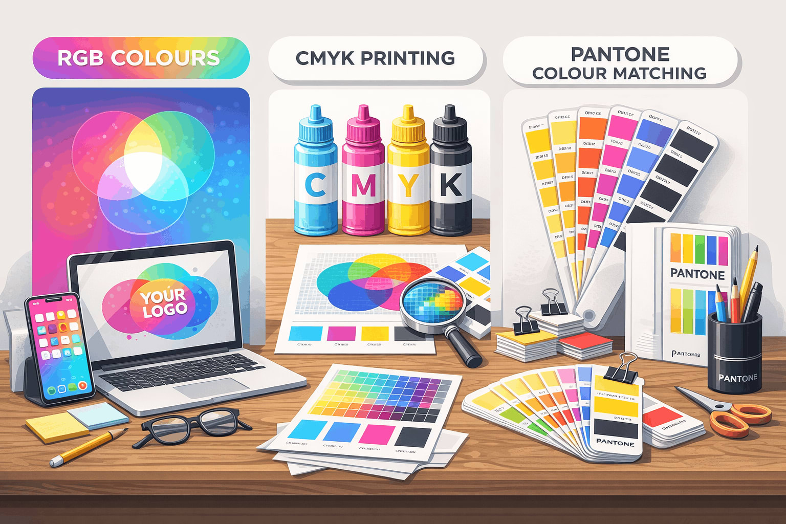
Colours look different on screens than in print because digital uses RGB, while printing uses CMYK or Pantone inks. For accurate and consistent branding on promotional products and apparel, colour approvals are needed and logos must be supplied as vector files (AI, EPS, SVG or vector PDF) to ensure clean, high-quality printing.
When ordering branded apparel or promotional products, one of the most common points of confusion is colour. Clients often ask:
“Why doesn’t my logo look the same as it does on my screen?” or “Why do you need my logo in a special file format?”
Understanding how colours work in print-and why printers request specific logo files-can save time, money, and prevent disappointing results. Here’s a simple breakdown of what you need to know.
RGB / RGBA: Colours for Screens, Not Print
Most logos and brand assets are originally created for digital use. These use RGB (Red, Green, Blue) or RGBA (Red, Green, Blue + Alpha/opacity) colour formats.
RGB is designed for screens, not physical products. Phones, laptops, and TVs use light to display colour, which allows for very bright, vibrant shades-especially neon pinks, electric blues, and glowing greens.
The problem: These colours often cannot be reproduced exactly in print, because ink on fabric or products reflects light rather than emitting it. What looks bright and punchy on screen may appear duller when printed.
This is why colours can “shift” between your digital mockup and the final printed t-shirt, cap, or tote bag.
CMYK: The Standard Colour System for Printing
Most commercial printing uses CMYK (Cyan, Magenta, Yellow, Black). Instead of light, CMYK mixes inks on material to create colour.
In promotional products and apparel printing:
- CMYK is used for full-colour digital printing, heat transfers, DTG (Direct-to-Garment), and packaging.
- CMYK has a smaller colour range than RGB. Some colours simply can’t be matched perfectly.
This means that when your digital logo is converted from RGB to CMYK, the printer must choose the closest possible match, not an exact copy. This is normal, and it’s why approvals are often requested before production.
Pantone: The Gold Standard for Brand Consistency
Pantone is a global colour matching system. Each Pantone colour has a unique code, and the ink is mixed to match that colour exactly.
In the promotional product and branded apparel industry, Pantone is commonly used for:
- Screen printing
- Embroidery thread matching
- Corporate merchandise
- Large production runs where colour consistency matters
Why Pantone is important: If your brand colour is locked as a Pantone, you can send that reference to any supplier worldwide and get the same colour result across t-shirts, hats, drink bottles, packaging, and signage.
For brands that care about consistency, Pantone is the most reliable option.
Why We Ask for a Vectorised, Workable Logo File
Another common question is:
“Why can’t I just send you my logo from Instagram or my website?”
The reason is print production requires vector artwork, not low-resolution images.
Raster vs Vector (Simple explanation)
- Raster files (JPG, PNG, screenshots) Made of pixels Lose quality when enlarged Often unsuitable for printing
- Made of pixels
- Lose quality when enlarged
- Often unsuitable for printing
- Vector files (AI, EPS, SVG, PDF vector) Made of mathematical paths Can be scaled to any size without losing quality Required for screen printing, embroidery, engraving, and most production methods
- Made of mathematical paths
- Can be scaled to any size without losing quality
- Required for screen printing, embroidery, engraving, and most production methods
Why vector logos are required in production
Printers need vector files because:
- Logos must be resized for different products (caps, shirts, signage, etc.)
- Colours need to be separated for printing
- Edges must be clean and sharp
- Embroidery machines and screen printing setups require vector paths
Without a vector file, your logo may appear:
- Blurry
- Pixelated
- Incorrectly shaped
- Inconsistent across different products
This is why suppliers often request a “vectorised, workable logo file.” It ensures the final product looks professional and matches your brand.
What This Means for Your Brand
To get the best results when ordering promotional products or branded apparel:
- ✅ Provide your logo in vector format (AI, EPS, SVG, or vector PDF)
- ✅ Approve CMYK or Pantone colour matches before production
- ⚠️ Don’t rely on how colours look on screen, screens vary in brightness and calibration
- 🧪 For large or important orders, request a physical sample or pre-production proof
Final Thoughts
Great branding isn’t just about design, it’s about consistency in the real world. Understanding how colours translate from screen to print, and why professional artwork files are required, helps ensure your branded merchandise looks exactly how your brand should: clean, consistent, and high quality.
If you’re unsure about your logo files or brand colours, a good supplier will help guide you through the process before anything goes to print, saving you costly mistakes and reprints.